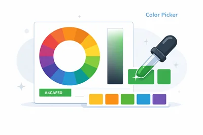
A Color Picker turns a visual choice into a reusable value. With FastToolsy’s Color Picker & Palette Generator, you can pick a color, convert it between formats, and generate palettes that stay consistent across design and development.
Quick answer: open the tool, select a base color, copy the HEX/RGB/HSL/CMYK value you need, then generate a harmony palette (complementary, analogous, triadic, split, or shades) and save colors locally in your browser.
This guide shows how to use the Color Picker effectively, what each format means, and how to avoid common pitfalls like copying the wrong code or choosing colors that fail contrast requirements.
How the Color Picker fits into real workflows
Color decisions show up everywhere: button states, charts, icons, hero sections, and email templates. The challenge is not finding a “pretty” color, but keeping that choice stable as work moves between tools, teammates, and devices. When you rely on eyeballing, you get slightly different shades each time. When you rely on numeric values, you get consistency.
The FastToolsy Color Picker is designed for that consistency. It exposes the same color in multiple numeric formats and helps you generate related colors using basic color harmony patterns, so a single base pick can become a small system.
Step-by-step: using the FastToolsy Color Picker
- Open the tool and click the main swatch in the “Pick a Color” area.
- Choose a color with your browser picker, or paste a HEX value if you already have one.
- Copy the output format you need: HEX, RGB, HSL, or CMYK.
- Go to “Generate Palette” and pick a harmony type.
- Save the current color (and any palette colors you want) to your local saved list.
- Paste values into your design file, CSS variables, or documentation.
Small habit that pays off: pick once in the Color Picker, then copy from the tool every time you need the value. That prevents “near matches” that slowly creep into a UI over weeks.
Formats explained: HEX, RGB, HSL, and CMYK
The tool shows four common representations. Each is valid, but each shines in different situations.
HEX for web themes
HEX values look like #RRGGBB. They’re compact, easy to paste, and common in CSS, Tailwind configs, and design tokens. If your workflow is web-first, HEX is often your default export.
RGB for computation
RGB expresses the red, green, and blue channels (0–255). Developers prefer RGB when they compute gradients, mix colors, or apply transparency using rgba().
HSL for intuitive tweaks
HSL (hue, saturation, lightness) is great when you want to keep the same hue family but adjust intensity—like creating a softer background tint or a stronger hover state.
CMYK for print starting points
CMYK is mainly for print workflows. It won’t perfectly match the screen because printing is subtractive, but it provides a reasonable baseline for discussing print specs with vendors.
Because these values are shown together, the Color Picker doubles as a converter: you can paste a value in one format, then copy the others without switching tools.
Palette generation: from one color to a usable set
Most interfaces need more than one color. You need emphasis, surfaces, borders, and states. Palette generation helps you move from a single accent to a set that feels intentional.
Complementary
Complementary colors sit opposite each other on the color wheel. They create strong contrast and are useful for calls-to-action. Use this when you need a clear “pop” against a background.
Analogous
Analogous colors are adjacent on the wheel. They feel cohesive and are helpful for gradients, illustrations, and subtle multi-color UI elements.
Triadic
Triadic schemes use three evenly spaced hues. They can feel energetic and brand-forward, but they need careful balance so the UI doesn’t become noisy.
Split complements
Split complements soften the intensity of strict complementary pairs. If the complement feels too harsh, split schemes often look more refined while keeping contrast.
Shades
Shades give you lighter and darker variants of the same hue family. This is where state design becomes easy: default, hover, active, and disabled can come from a single shade ladder.
After generating options, return to the Color Picker whenever you need to verify that the palette colors still align with the base hue and the intended contrast.
Two mini-examples
These examples show how to translate picker output into something you can ship.
Mini-example 1: CSS variables for a button
Pick a base accent, then choose one darker shade for hover and another for active. Store them as variables so every button uses the same values.
- --brand-500: base
- --brand-600: hover
- --brand-700: active
When you later adjust the brand color, you only update the variables, not dozens of components.
Mini-example 2: a landing page palette checklist
Select one accent, one supporting accent, one background tint, and two text colors (dark and muted). Then test the set across hero, cards, and buttons before you finalize.
- Accent
- Support
- Background tint
- Border
- Text (primary and secondary)
In both cases, the Color Picker helps you keep the values consistent while you iterate on layout and typography.
Common mistakes (and how to avoid them)
Copying the wrong format
Some systems expect HEX, others expect rgb() or hsl(). If you paste the wrong format, you may get validation errors or unexpected colors. Decide on a “token format” for your project and stick to it.
Sampling from anti-aliased edges
When you sample from screenshots or UI exports, edges often contain blended pixels. Sample from a flat interior area to avoid picking a blended color that doesn’t exist in the original palette.
Forgetting about transparency
Overlays and shadows depend on alpha. If you only use solid colors, your UI may look heavier than intended. Use RGB outputs when you need rgba() or modern CSS color syntax that supports alpha.
When you standardize these habits, the Color Picker becomes a reliable part of your daily workflow rather than a “one-off” utility.
Edge cases you will run into
Colors look different on another device
Brightness, night modes, and wide-gamut displays can change perception. Align on numeric values first, then test your palette across at least two devices. Consistency comes from shared values, not a single screen.
Print output doesn’t match screen
Even with CMYK values, printing involves paper, ink, and calibration. Treat CMYK as a starting point and request a proof for color-critical work.
Very saturated “neon” colors
Some vivid colors are hard to reproduce in print and can clip on older displays. If a color feels unstable, reduce saturation slightly and reassess.
The best fix is to use the Color Picker for quick adjustments, then validate the result in the environment where it will actually be used.
Accessibility: don’t skip contrast
A palette that looks good can still be hard to read. After you choose an accent and backgrounds, check contrast for body text and key UI elements. If contrast fails, adjust lightness in HSL rather than randomly choosing a new hue—this keeps brand identity stable.
Because the Color Picker updates values instantly, you can tweak lightness, re-copy the numbers, and re-test without slowing your workflow.
Design-system tips: naming, scales, and dark mode
To prevent color sprawl, define a scale (for example 50–900) and map colors to roles (surface, border, text, accent). Keep a short list of allowed tokens and discourage ad-hoc HEX values in components.
For dark mode, you typically choose darker surfaces and lighter text, then pick an accent that stays vibrant on dark backgrounds. Often that means using a slightly lighter accent token for dark surfaces than you use on light surfaces. Build both ladders from the same hue family so the brand still feels like itself.
Use the Color Picker to generate shade ladders, then choose tokens that preserve contrast and hierarchy in both themes.
Privacy and accuracy note
The tool stores saved colors locally in your browser. Results are intended for typical design and development use. For color-critical work, verify the final palette in your primary design software and with real-device testing.
If you want to move faster without losing consistency, use the Color Picker to pick one base color, generate a harmony palette, and copy the exact codes directly into your style guide and components.
Frequently Asked Questions
What formats does the Color Picker support?
It provides HEX, RGB, HSL, and CMYK outputs so you can copy the format that fits your toolchain.
Can I generate palettes automatically?
Yes. Choose a harmony type like complementary, analogous, triadic, split, or shades to generate a matching set from your base color.
Are saved colors synced to my account?
No. Saved colors are stored locally in your browser. If you need portability, copy your final values into a document or a token file.
Why does the same color vary between screens?
Different displays have different calibration, brightness, and gamut. Agree on numeric values, then test across devices before finalizing.
When you are building a UI kit, keep the Color Picker open while defining your primary, secondary, and neutral tokens so every component references the same base values.
A practical way to sanity-check brand updates is to paste the old value into the Color Picker, then paste the new value and compare side by side before you roll changes into production.
If you work with product screenshots, the Color Picker helps you confirm whether the “same” blue is actually consistent across pages or whether a subtle drift has occurred.
For charts and dashboards, use the Color Picker to choose a categorical palette with clear separation between series, then create lighter tints for hover and selection states.
When you need a background tint that still feels on-brand, start with the base hue in the Color Picker and lower saturation and raise lightness slightly rather than switching to a different hue.
If your team uses Tailwind or design tokens, the Color Picker is a quick way to translate a chosen color into a full 50–900 scale by selecting shades and documenting the results.
For gradients, pick both endpoints in the Color Picker and keep them in the same hue family so the gradient looks intentional instead of muddy.
If you are matching a competitor’s UI for analysis, the Color Picker helps you capture representative values, but you should still avoid copying branding directly in production.
When you create email templates, the Color Picker helps you pick web-safe values that remain readable across clients with different rendering quirks.
In documentation, include the values from the Color Picker plus a small usage note (for example: “buttons only” or “background surfaces”) to prevent accidental misuse.
If a stakeholder requests “slightly more contrast,” use HSL from the Color Picker to nudge lightness in small increments and re-test instead of re-picking randomly.
For icons, the Color Picker can help you align stroke and fill colors across multiple SVG assets so they look consistent in a set.
If you ship both light and dark themes, use the Color Picker to verify that accent colors keep enough contrast against both surface palettes.
When you receive a HEX value in a ticket, paste it into the Color Picker to preview it instantly and convert it to RGB or HSL for the context you need.
For print handoffs, treat CMYK from the Color Picker as an estimate and always request a proof for critical marketing materials.
If you are debugging “why this button looks different,” the Color Picker makes it easy to compare computed values from CSS with the intended token values.
When you finalize a palette, export the list by copying values you saved via the Color Picker into your brand guide so it survives browser clears and device changes.
Advanced use: building consistent tints, shades, and semantic roles
Design systems rarely use raw colors directly. Instead, they define semantic roles: success, warning, error, info, surface, border, and text. Each role then maps to a small scale of values for different contexts. For example, “success” might include a light background tint for banners, a mid tone for badges, and a dark tone for text or icons. This reduces ad-hoc decisions and makes it easier to maintain a consistent product feel.
To build those scales, start with a base hue and create controlled steps. For web UI, the simplest approach is to adjust lightness and saturation in small increments while watching contrast. Keep steps large enough to be distinguishable, especially for states like hover and active. If your steps are too subtle, users may not notice interaction feedback. If they are too strong, the UI can feel jumpy.
Semantic mapping also helps accessibility: if the “error” role always uses the same token values, users learn the pattern and scanning becomes faster. The same logic applies to status chips, validation messages, form borders, and alert backgrounds.
Color harmony in practice: when to break the rules
Harmony schemes are useful starting points, not commandments. Complementary pairs can be too intense for large surfaces, and triadic palettes can become chaotic if all three colors compete for attention. A practical approach is to use one color as the main accent and keep the others as supporting elements used sparingly.
In UI, hierarchy matters more than theoretical perfection. If a palette is “harmonious” but reduces clarity—buttons blend into backgrounds, charts become hard to read, or links don’t look clickable—adjust the palette to prioritize usability. Often the fix is as simple as choosing a darker shade for text or reserving the brightest color for only one element type.
Quality assurance checklist for color implementation
- Check hover, focus, and active states across interactive elements.
- Verify contrast for primary text, secondary text, and disabled text.
- Validate status colors (success, warning, error) in both themes if you support dark mode.
- Review charts with common forms of color-vision deficiency in mind; avoid relying on color alone.
- Confirm the same token values are used across web and mobile implementations.
- Test in bright and dim environments to catch “washed out” accents.
Collaboration tips for faster approvals
Color feedback is often subjective. You can speed up approvals by framing decisions in constraints: “This shade keeps contrast above our threshold,” “This hover state is visibly different without being distracting,” and “This palette limits accents to two so the CTA stays dominant.” When feedback is grounded in a shared checklist, teams converge faster.
When you share options, avoid sending a single screenshot. Provide the numeric values and show them applied to actual components (buttons, links, cards) so stakeholders judge in context. Context prevents endless cycles of “a little more blue” that do not translate into actionable changes.
Keeping color choices maintainable over time
Colors tend to multiply as products grow. A quick campaign page introduces a new accent. A new dashboard chart adds another shade. Months later, nobody remembers which values are “official.” The fix is to treat colors like any other system asset: version them, document them, and review changes in code review.
When you add a new color, define why it exists, where it should be used, and which tokens it should not replace. Then audit your UI periodically to remove duplicates that differ by one or two units. A smaller, well-documented palette almost always produces a cleaner interface and faster development.
Document your palette decisions early, and keep updates small and traceable.