Color Picker for Simplifying Design Workflows
Explore FastToolsy free browser tools! Access calculators, converters, timers, text tools, and more — no sign-up required.
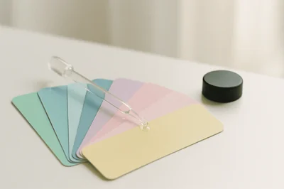
Color choices can feel oddly high stakes. Pick the wrong shade of “almost black” for text and the page turns gray and tired. Pick the wrong accent color and a button stops looking clickable. A good color picker takes that pressure off by making color selection quick, repeatable, and easy to share with others.
The best part is that you no longer need a heavy app installed just to grab a HEX code. A free online color picker can handle most day to day work, including pulling colors directly from images.
What a color picker actually does
A color picker is two tools in one: a selector (sliders, wheel, or eyedropper) and a translator (turning what you see into codes you can paste into design files or CSS). Most tools will give you at least HEX and RGB, and many add HSL, HSV, and sometimes CMYK.
Some pickers are built for precision and accessibility testing, while others are built for speed and inspiration, like generating palettes from a single starting color.
One sentence that helps: a color picker is less about finding “a pretty blue” and more about creating a reliable value you can reuse everywhere.
Choosing the right tool: the five checks
Before you pick a tool, it helps to name what “good” means for your workflow. If you only need a one off HEX value, almost anything works. If you’re handing off a palette to a team, details matter.
Here are practical checks that quickly narrow the field:
- Format support
- Image sampling
- Palette export
- Accessibility checks
- No sign up friction
If you work across design and development, prioritize tools that show multiple formats at once and make copying painless. If you care about inclusive UI, contrast checking and color vision simulation move from “nice to have” to “must have.”
Picking colors from images without guesswork
Image based picking is where online tools shine. You upload a screenshot, photo, or logo, click a pixel, and copy the color values. That is the basic loop.
What trips people up is not the process, it’s accuracy. JPEG compression can add subtle artifacts around edges and gradients, which means the pixel you click may not be the “true” brand color. PNG tends to be more faithful for flat colors. Many tools assume sRGB, so colors can look different if the image uses a different profile.
A simple workflow keeps results clean:
- Start with the best source: use a logo SVG or a high quality PNG when possible.
- Zoom in before clicking: avoid anti aliased edges where colors blend.
- Sample more than once: click a few nearby pixels and compare values.
- Copy the right format: HEX for web UI, RGB/HSL when you plan to tweak.
If the goal is a full palette, not a single pixel, look for tools that extract dominant colors automatically. Those are useful when you want a consistent theme from a photo (a hero image, a product shot, or a thumbnail) without manually clicking ten times.
Popular free color pickers and what they are best at
There is no single “best” choice for everyone, so it helps to match tools to tasks. The set below is a practical shortlist based on common needs: palette generation, web sampling, accessibility, and image extraction.
Tool | Best for | Formats you can expect | Accessibility help | Notes |
|---|---|---|---|---|
Coolors | Fast palette generation | HEX, RGB, HSL (CMYK via conversion) | Contrast checker | Strong for brainstorming and exporting palettes |
Adobe Color | Color theory plus pro workflows | HEX, RGB, HSL, CMYK, more | Contrast checking and color blind simulation | Great depth, saving themes may require sign in |
ColorZilla (extension) | Picking colors from any webpage | HEX, RGB | Limited | Pixel sampling directly in the browser |
Paletton | Harmony modes and previews | HEX/RGB outputs, exports available | Contrast checks and color vision simulation | Useful for testing schemes on preview layouts |
Canva palette generator | Quick 4 color palette from an image | HEX | Limited | Very beginner friendly image to palette tool |
ImageColorPicker type tools | Direct pixel values from uploads | HEX, RGB, often CMYK/HSL/HSV | Limited | No frills, good for “click and copy” |
If you are picking a UI theme for an app or design system, Adobe Color and Paletton stand out because they make harmony rules and accessibility checks part of the process. If you are grabbing a color from an existing site to match a component, a browser extension is hard to beat.
Format cheat sheet: HEX vs RGB vs HSL vs CMYK
Color pickers often show multiple models at once, and that can feel redundant until you know why they exist. The key idea: different models make different tasks easier.
Format | What it represents | When it’s most useful |
|---|---|---|
HEX | RGB encoded as hex digits | CSS, design tokens, quick sharing |
RGB / RGBA | Red, green, blue (plus alpha) | Screen based work, transparency |
HSL / HSLA | Hue, saturation, lightness (plus alpha) | Adjusting brightness or muting colors while keeping hue |
CMYK | Cyan, magenta, yellow, black | Print oriented workflows and vendor conversations |
A practical tip: if you need “the same color, just a bit darker,” HSL is often the fastest way to adjust without changing the character of the hue. If you need the same color at 60% opacity, RGBA or HSLA is the cleanest copy paste.
A practical workflow that stays consistent
Once you have a picker you like, the bigger win comes from a repeatable process. This keeps colors consistent across files, pages, and teammates, and it reduces the “why does this look different here?” spiral.
A simple, reliable approach looks like this:
- Capture: pick 1 to 3 base colors from a logo, UI reference, or image.
- Build: generate supporting colors (neutrals, accents, states) using a palette tool.
- Verify: run contrast checks for text and key UI elements.
- Ship: export to the formats your team uses (CSS variables, design tokens, swatches).
If you are working from images, treat the picked pixel values as a starting point. You can keep the hue while adjusting saturation and lightness for readability, hover states, and dark mode.
Common pitfalls: accuracy, contrast, and “almost the same” colors
The easiest way to get bad results from an image color picker is sampling the wrong pixel. Anti aliased edges are the main culprit. A logo might look like it has one flat blue, but the edges include many blended blues to smooth the shape against the background. Clicking those pixels gives you slightly off values that cause visible mismatches later.
Gradients create a different problem: you may pick a mid point color that never appears as a solid region in the design. If you are recreating a gradient, grab multiple stops and rebuild it rather than relying on one sample.
Contrast is the other big one. A palette can look great in a generator and still fail for body text. Tools with WCAG contrast checking are worth using early, not after the UI is built.
Where FastToolsy fits in a color picking workflow
FastToolsy focuses on quick, in browser tools that work without sign ups or downloads, with privacy as a default. That matters when you are moving fast and do not want to upload work files to a service that keeps them longer than necessary.
A color picker is often used alongside “small utility” steps that come up in real projects: compressing an image before sharing it, converting data formats for a style guide, cleaning text for a filename, or generating consistent slugs for design tokens. Having those tools in one place reduces tab overload.
FastToolsy is also built to be accessible for a global audience, including English and Arabic speakers and RTL users. That can be helpful when color notes, palette names, and handoff docs need to work for mixed language teams.
Privacy wise, the most comfortable setup is always: do as much as possible locally in the browser, copy what you need, and move on. When you are extracting colors from images, that mindset keeps sensitive drafts and client work from being scattered across accounts.
Picking the “best” tool based on what you actually do
If you mainly need colors from images, prioritize a picker that supports uploads, zooming, and multiple output formats. If you mostly build UI themes, prioritize harmony tools plus contrast checking. If you mostly code, prioritize copy friendly outputs and browser based sampling.
What matters is not having the fanciest interface. It’s getting reliable color values quickly, checking readability, and sharing results in a form other people can use without confusion.